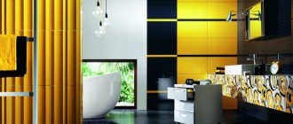
Choosing a color palette is one of the main design tasks. And if we talk about the combination of colors in a bathroom or bathroom, then there is no definite answer. But some recommendations, tips, ideas and photos will certainly help you choose the best option. The design of a bathroom with painted walls has long ceased to be an example of a budget renovation. In many cases, it is the best choice for implementing complex design ideas.
Many designers offer original wall painting as a “highlight” of the bathroom interior
Of course, there are also situations when long-term repairs are not included in the immediate plans, but only a light update of the interior is required. Or painting is part of a combined finish. In any case, you need to decide on colors, shades and their possible combinations.
Rules for choosing shades in the interior
The choice of color solutions is influenced not only by individual taste preferences, but also by a number of other factors. In particular, you need to consider how the space is perceived visually. It's no secret that light colors visually enlarge the room, while dark colors make it smaller.
It is also necessary to remember about the psychological perception of colors.
In addition, when choosing shades, you should focus on the stylistic direction. The concept of any style implies certain patterns in the selection of colors. You can outline general recommendations for bathroom design.
Try not to use more than three different colors or more than five shades of the same color. In the opposite situation, the interior will not be harmonious. Most often, they make do with only two tones, which are often either contrasting or adjacent. In any case, one color should emphasize the meaning of the other.
For those who prefer a single color design, the optimal solution would be to use three shades to highlight all the details of the bathroom.
When determining the acceptable brightness level, consider the size of the bathroom. Keep in mind that in most standard apartments it is important to use light shades that expand the space. This is due to the small area of the bathrooms.
Remember that bright colors will help to cheer you up and lift your spirits, while a calm palette will contribute to a relaxed atmosphere.
Choosing a color palette according to Feng Shui
Recently, many have been creating designs based on the principles of oriental geomancy, in other words, choosing the color and layout for the bathroom according to Feng Shui.
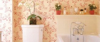
The interior, according to the rules of Feng Shui, involves painting the walls with natural colors
According to Taoist teachings, the bathroom is designed to cleanse a person from fatigue, stress and restore strength, so the walls here should not be very bright, and the ceiling should be left white and smooth. Optimal colors would be pastel shades of green, blue, purple and white. Black, gray and brown are considered undesirable. It is very important to make contrasting accents. These can be ornaments, borders or friezes on the walls, furnishings. For them you can choose bright shades of yellow, red, green, blue or purple.
Bathroom tile color combination
Waking up, the man rushes to the bathroom. Also, most people have a habit of taking water procedures in the evening. The color of the tiles in the bathroom shapes psychological activity. Gamma affects human health.
The color of bath tiles must be chosen responsibly. Tile has become a popular finishing material for the bathroom.
This is facilitated by the practicality, aesthetics and durability of the material. Tiles in two colors in the bathroom, as well as ceramics, show a richness in the depth of shades. It remains to be seen which colors of ceramic bathroom tiles look best.
Nothing stops your imagination in choosing a palette. There are only recommendations. The floor should be darker to emphasize the height of the room. The ceiling can be either light or dark. It is recommended to use tiles on the walls that are lighter than the floor tiles. Gloss can only be used on vertical surfaces.
Matte tiles on the floor prevent slipping. The gloss quickly wears off under the influence of constant friction.
Bathroom tile color
It has been proven that the palette in the interior affects all systems of the human body. The color of the tiles in the bathroom is the first visual shock that a person receives in the morning.
The gray palette gives the interior completeness and makes an aristocratic contribution. Tinted tiles will allow you to focus on the details. Don’t forget, gray is the color of despondency, autumn blues, and sadness. Excess causes depression of the nervous system. Separate areas can be gray: shower room, space above the sink, window slopes.
At first glance, the colorless interior evokes a wow effect. But it quickly gets boring and begins to tire.
Green tones work well in the bathroom. The aqua tile color in the bathroom is calming. Light green saturates the room with energy and invigorates. Is the color of joy. It is recommended to combine coniferous shades with gray to create a “Siberian” range. Green colors contrast favorably with red ones, imbuing the interior with dynamism.
Deep indigo in large quantities puts pressure on the psyche, awakening interest.
Blue shades in moderation are calming. It is recommended to dilute with white. Blue hides light and space; good lighting is required. More often used to accent certain areas of bathrooms.
Red shades are emotional and increase tension. Burgundy and pink cause discomfort. It is difficult to play with shades in the interior. Red can both inspire and depress. Good to use with black and white tiles. This is a stable triad in many cultures.
The color of joy and energy is yellow. It is not recommended to use in large quantities, it causes anxiety and depression. Yellow color should be no more than 30% in the interior. It does not narrow, but on the contrary, expands the space, if not abused. Pairs with white and green.
Purple is used in premium interiors, hotel bathrooms, and expensive apartments.
The colors of ceramic bathroom tiles go well with yellow and gold. Designers introduce gray tones in combination with purple, which adds exclusivity to the interior. The color consists of red and blue. tiles of two colors in the bathroom have an effect on the psyche - it can be both calming and stimulating.
Brown, green colors of bath tiles are shades of the forest, the ancient human environment. Under these conditions, the brain rests, turning to the origins of life. Brown works well in a matte finish. The color of the earth reflects stability and the value of the family hearth.
Deep tonality causes an overload of perception of the interior. Recommended to be combined with white, yellow, green, beige.
The black color of the tiles in the bathroom is depressing. Gives the interior rigor and conciseness. Aristocratic bathrooms with rich interiors are built on a base of black, white, red and gold. A large amount of black causes irritation. In moderate quantities, it awakens creativity and adds sophistication to the interior.
The tiles appear in subtle floral patterns or futuristic graphics.
Orange
An ideal option for those who dream of a bright and invigorating interior. Such a bathroom will give its owners positive emotions. Designers claim that this color scheme will help you wake up faster and recharge your batteries.
Orange color is not suitable for those who like to lie in the bath for hours and relax. If you watch it for too long, it will begin to tire you and even irritate you. Contrasting combinations of orange (walls, ceiling) and black (furniture, plumbing) colors look impressive.
Bathroom tile color color combinations
The combination of black, white and red always looks the most advantageous. In many cultures, these colors symbolize the main elements, organs of perception, and qualities. The gloomy state of black and red is broken by the introduction of white. A spectacular contrast in nature is formed.
- White looks harmonious with all colors and shades. Designed to bring purity and stabilize the influence of the local palette. The color combination of ceramic bathroom tiles plays differently when white is introduced. With delicate turquoise it creates freshness and harmony with nature. Light colors reduce the need for lighting.
White is an impractical color. Requires increased attention to cleanliness and order. Highlights all the imperfections in the interior.
Two-color tiles in the bathroom can create both peace and dissonance. The sharpness of the differences in tonality and warmth-coldness is of great importance. Introducing two opposite colors creates excessive contrast. Black and white in a checkerboard pattern is an unpleasant combination. The addition of shades, red, green, yellow completely changes the situation.
A damper is formed between the two oppositions, stabilizing the acuity of perception.
Possible color combinations: designers' secrets
Designers have one secret that allows them to always choose the right combinations of colors and shades, be it a bathroom or any other interior to be painted - this is the so-called Johansen Itten circle. To work with it, it is enough to know four simple formulas.
Johansen Itten circle for choosing compatible colors
- The two most compatible colors are located opposite each other (for example: blue and orange).
- Classic three colors. Choose colors that are equidistant from each other (for example: blue, red and yellow).
- Analog triad. Choose any 3 shades located next to each other (for example: yellow-orange, yellow and yellow-green).
- Contrasting triad. One color will be the main one, and two shades are added to it, which are adjacent to the opposite one (for example: the main color is purple, and additional ones: yellow-orange and yellow-green).
Gray color combination in the bathroom
Shades of Gray
Color has a wonderful ability - the reflective properties of gray allow you to visually present the bathroom space more favorably. But each shade handles this differently.
Shade variations:
- steel silver - “pushes” the walls, changes the perception of the room, it seems larger and more complex in shape;
- classic gray – loves contrast;
- wet asphalt – intelligent, elegant, self-sufficient;
- light gray – a light optimistic shade;
- dark gray is a color that heightens sensitivity and gives self-confidence;
- gray pearlescent - suitable for a bathroom interior with a claim to glamour;
- gray-green tea is a very fashionable and stylish shade for a small bathroom;
- steel - in the bathroom it can be too strict;
- charcoal - turns the bathroom into a noir island;
- quartz - combined with ivory color;
- slate - an excellent choice for a Scandinavian-style bathroom;
- anthracite is a color for those who deny gloom, calling dark finishes noble and delicate;
- dove color is gray with a bluish-white tint.
Obviously, there are many shades and each one sets its own mood in the room. But the combination of colors sets the mood even more.
Yellow
Sunny and warm color. It will add hospitality and comfort to the room. It is used by owners of all ages. However, it is recommended if there are small children in the family.
The yellow color of the ceilings in the bathroom is in perfect harmony with the colors on the walls. It also goes well with red and green.
A color scheme
Gray “makes friends” with many colors; it is a pleasant and almost win-win companion. But still there are more and less successful variations.
Combined with gray:
- pink is one of the best combinations that creates a fresh and cozy interior;
- turquoise – dynamics and freshness are not lacking in this color combination;
- beige - it will be beneficial to set off warm shades of gray;
- red is a bold and decisive combination, suitable for those who love brightness and expressiveness;
- peach – for a warm bathroom (but not very cramped);
- blue is a good solution, but the geometry of the room must be ideal;
- brown – a brown-gray bathroom implies a fusion of transitional colors that are in the same temperature plane;
- green – a bathroom in gray-green tones will be an excellent option for those who miss active, dynamic interiors;
- blue is a classic companion; a bathroom in gray-blue tones will be soft, pleasing to the eye, creating a calming mood;
- yellow – a yellow-gray room is bright and fresh; such a space needs very good lighting.
But using a third color for finishing is a big risk. If you want to dilute the two-color combination, do it with textiles or even a plant that suits the conditions of the bathroom.
Color combination in the bathroom beige
Beige can be different: from caramel, cream, sand and wheat, to biscuit and opal, as well as ivory or cappuccino. Warm tones create a softer atmosphere, while cool tones create a more formal feel. The abundance of natural light in the bathroom requires the addition of cool tones to avoid the feeling of cramping.
A popular solution for creating comfort is furniture made from natural materials.
For color combinations with a cream palette, several options are suitable:
- Green details will add freshness. Small details should be more saturated, and large ones should be of a muted shade. The following photo shows the contrast between the accessories used in a beige bathroom.
- Blue and rich blue colors will add coolness and sophistication to the interior. It dims the abundance of sunlight.
If there is little sunlight in the room, you can complement the main background with elements of other shades of the palette, and place bright blue details, for example, textiles, in the center of the composition.
Rich colors: red, bright yellow, orange and purple. They bring positive notes. However, you should have an initial idea of the final result in order to avoid overloading the interior.
When combining beige tones in a bathroom design, you should shift the emphasis to the texture of the materials used.
The ensemble with brown looks sophisticated in any combination.
- Gray details will add modernity and laconicism to the interior. In this case, a rich gray shade looks the most successful.
- White will visually enlarge the space and give a feeling of cleanliness. The design of a beige bathroom combined with white details is shown in the photo below.
- Black also goes well together. However, for a successful composition there should be as little dark as possible. For example, black plumbing among light walls looks very impressive.
Stylish and bright orange bathrooms
Orange is one of the most active colors of the warm color scheme, which combines the depth of red and the energy of sunny yellow. Orange symbolizes sunset, carefreeness and pleasure; this color creates an atmosphere of celebration, fun and happiness in the interior of the house, filling the rooms with the warmth of the sun even in the cold winter. However, like other bright colors, orange must be used wisely and in a balanced manner so as not to overwhelm the room with the excessive energy of this orange color. So, in the photo below we see a stylish bathroom in a rustic style; the designers used bright orange paint to decorate the walls, and the room was complemented with stylish orange lamps from Studio 80 Interior Design.
Bathroom in orange.
To enliven a stark industrial-style bathroom, Thomas Roszak Architecture used bright tones of orange.
Orange bathroom in industrial style.
Orange color has a large number of shades: from defiant to delicate apricot and peach. The main use of orange is considered to be accentuation, so orange is more often used for accessories and furniture than for walls and floors. It is also necessary to keep in mind that orange has the property of displacing absolutely all tones and shades of other colors.
Stylish bathroom with orange walls.
Dotter & Solfjeld Architecture + Design enlivened the interior of a spacious modern bathroom in dark gray with bright orange accents and elements.
Bathroom with orange elements.
Orange goes well with neutral white. Thus, the designers of CCI Renovations used bright orange slabs to decorate one of the bathroom walls.
Small bathroom in white and orange tones.
Small bathroom with orange accessories.
Stylish bathroom with decorative orange tiles.
Habitat Architecture complemented the small industrial-style bathroom with shower curtains and bright orange towels.
Orange color in an industrial bathroom.
Black and white bathroom with orange elements.
Color combination of tiles in the bathroom
Regarding color - red, blue, green, etc. - no one can definitely give you advice. Again, rely on your own preferences. But when choosing shades there are certain recommendations:
In a small room it is better to use light colors. This makes it look more spacious.
You can also use dark ones, but only in fragments - lay out a strip (vertical or horizontal), part of a wall, or even one wall, but definitely not the entire room. When decorating a bathroom with tiles, just like when gluing wallpaper, they practice combining several “friendly” or contrasting colors.
To prevent the atmosphere from reminiscent of an operating room, use warm shades.
A large design looks great in a spacious bathroom, and makes a small one look even smaller. Therefore, in small bathrooms they use small or medium-sized tiles, and if you want a pattern, then not very large or in the form of a small fragment. We advise you to pay attention to the mosaic. It is very beautiful and looks great in small spaces. The downside is that it is expensive.
The solution is to find a tile of a standard size, but imitating a small one (as in the photo below). It is cheaper in price than mosaic, but looks almost the same.
Otherwise, the choice is unlimited. Bathroom tiles can be the color and combination you like. But the most advantageous options are combinations of brighter and more saturated colors with neutral ones. Neutrals are white and its shades, gray, beige. Of these, beige is the most commonly used. For example, a combination of dark red or burgundy and beige is often found; brown (chocolate) is also combined with it.
Bathroom tiles look no worse when combined with green and beige, pink and gray (or also beige).
The most difficult thing is to choose a companion color to yellow and orange. The safest option is white, but not snow-white, but creamy or with a very light pinkish tint. You can try to find a shade of gray, but you need to match it to a specific color. In any case, try to choose from “warm” shades.
The combination of colors in the interior of the bathroom is blue
The interior may be monochrome, but it is still more popular when arranging a bathroom to use companion colors for blue.
When choosing them, you need to take into account the rules of good compatibility of tones, otherwise the result will be far from harmonious.
White
A blue and white bathroom is the ideal solution; it is considered a classic of the genre. The combination of white and soft blue is perfect for people who value a cool type of interior, as well as for a small bathroom.
White will become the background for light blue, emphasizing its depth, eliminating the “aquarium effect”.
However, a blue-blue interior may seem too detached and cold, so it is recommended to bring some warm tones into it in the form of accents. You can also use the technique of combining different materials and textures, for example, by combining ordinary tiles and ceramic mosaics, panels.
Grey
The gray-blue interior looks very organic and stylish. Gray gently absorbs the energy of blue, reducing the presence of the latter without oppressing it. Typically, the combination of gray and light blue is liked by men, since the atmosphere is brutal and gives purposefulness and determination.
Yellow
The yellow shade looks great when combined with blue, and it goes equally well with dark blue wall tiles. Yellow reduces the coldness of the heavenly color, eliminates the depressing effect on the psyche, and gives the room warmth and a feeling of a bright sunny sky.
Yellow will look especially beautiful in accessories and furniture.
Red
A bathtub in red and blue tones is rather an exception to the rule. Designers rarely use this option for decorating a room. The colors carry opposite meanings, have different temperatures and contrasting emotional colors, and therefore do not suit each other well.
It is better not to carry out unjustified experiments, otherwise the interior may turn out pretentious.
Orange
Unlike red, orange and blue look great. This solution is ideal for rooms designed in a Mediterranean style; it is reminiscent of the sea coast, sand, summer day, and juicy fruits. The interior in orange and blue tones invariably turns out to be bright and dynamic.
Green
The combination of green and blue necessarily requires dilution with white, because these tones are related, so they will merge without differentiation. The blue-green color scheme symbolizes the sea, and can be used to decorate a stylish interior with a thematic focus.
An excellent option is to replace green with turquoise: in a duet with soft blue it will look attractive and fresh.
Black
In order not to make the room gloomy or too oppressive, it is recommended to use black only as accents, and use blue in the lightest colors. It is better to exclude dark blue colors, because they will merge with black and cause an unpleasant feeling.
Various shades of blue
A good solution for the bathroom would be to combine blue with darker shades of blue. Without the inclusion of other tones, the interior will be monochrome, while it will look complete and harmonious only if there are the lightest shades coupled with saturated ones.
Usually 2-4 blue colors are used, with the darkest ones often located in the lower part of the room, and the light ones in the upper part.
Other colors
A duet of blue and brown is considered successful. Such a room will be a stylish, elegant, luxurious solution, especially when it is decorated in 2-3 different shades of heavenly tones and complemented with deep chocolate elements. If the room is small, it is better to introduce additional white notes into it.
Green color combination in the bathroom
The color green has about 30 primary shades alone! But no one has yet undertaken to count everything. Green is a combination of blue and yellow, and its shades are the predominance of one of these colors. So, green with a predominance of yellow is lime, olive, with a predominance of blue - turquoise, jade, with an approximately equal ratio of these colors - grass, emerald, verdepom.
Let us immediately note that designers unanimously advocate using several shades of green in the interior.
If you take this advice into account, then keep in mind that it is desirable that the floor and ceiling be the lightest shade of green used, the walls darker than the floor and ceiling, and the plumbing fixtures and furniture a rich color.
It is advisable to know the names of the shades to facilitate the search for materials. This will make it faster and more convenient for you to explain to consultants what exactly you are looking for. Therefore, we invite you to study a simple table of shades of green.
Combination of green with other colors Let's talk about the combination of green with other colors in the context of bathroom design. In this case, one of the most successful options is a combination of green and white. The traditional solution here is green trim and white plumbing.
Combination of green with other colors
Let's talk about combining green with other colors in the context of bathroom design. In this case, one of the most successful options is a combination of green and white. The traditional solution here is green trim and white plumbing.
The combination of green with beige and brown also looks good.
This way you can achieve the effect of maximum naturalness and environmental friendliness in the interior. The combination of green and black will give the room originality and modernity. A combination with orange or pink will add brightness.
It is important to note here that the green range tends to adopt the properties of the border palette. Depending on the companion color, green will be perceived as cold or warm.
Lighting
The most preferable option for yellow bathrooms is soft, diffused lighting. In large rooms, you can also add additional dim lighting to individual zones.
Depending on the chosen design style and the area of the room, you can use a variety of lighting fixtures: chandeliers, wall lamps, floor lamps. All this should be combined in tone and direction with the overall decoration of the room.
For example, a crystal chandelier on chains is quite acceptable in the classic interior of a yellow bathroom, but in rooms decorated in a high-tech or ethnic style, it will look at least alien.
IMPORTANT!
The yellow color itself is very warm and sunny; it does not need bright or even more contrasting lighting, since otherwise the interior will become too harsh and difficult to perceive.
Soft diffused lighting, on the contrary, will enhance the pleasant feeling of warmth and comfort and help make such a bathroom truly warm and cozy.
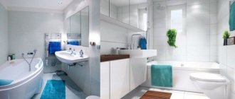
Turquoise color combination in the bathroom
Shades of turquoise are considered attractive, charming, sophisticated and modern, and hence go perfectly with modern home decor styles. A turquoise bathroom will be an excellent choice, as it is a place that is most often associated with relaxation and tranquility.
Color characteristics
Turquoise shades belong to the cold palette. It is believed that they have a positive effect on the psyche, calm, relieve stress, and fill with energy.
In addition, shades of color that resemble the sea create a feeling of freshness. This helps to lift your mood in the morning and relax in the evening. As a rule, the universal and most suitable bathroom color for combination is white. It is this classic combination of white and turquoise that causes the richness of the latter.
Turquoise color consists of two shades: green and blue. These are natural colors that do not strain the eyes. In addition, a complex tone allows you to play with color combinations, choosing shades that are in perfect harmony with each other.
It is obvious that turquoise does not go out of fashion and remains relevant for decades, appearing in new versions.
Combination of turquoise with other shades
When choosing a bathroom in turquoise tones, carefully consider the combination of colors and the harmony of interior textures. Keep in mind that turquoise looks good on shiny and matte surfaces, as well as in combination with them.
Among the materials in turquoise tone, preference is given to ceramic tiles and PVC panels. You can also choose paint or waterproof wallpaper that resembles water. This shade of turquoise looks good in small spaces.
The most obvious choice of combination with a turquoise shade is colors in the same palette. Agree, blue and green spots will look fantastic. The turquoise tone itself can spread out in certain areas rather than filling the entire room.
Alternatively, a turquoise accent wall or part of it. At the same time, it is better to combine different versions of this chic color.
For example, for the ceiling of a turquoise bathroom, choose the lightest shade. This will make the room visually taller. In addition, the color intensity should increase from top to bottom: mid-tones on the walls and rich turquoise on the floor.
On the other hand, wall tiles can be chosen in two colors and combined in a checkerboard pattern.
What colors say Psychology, meaning and perception of color
If you want to know a person's inner world, look into his room. Expressiveness, pedantic accuracy, laziness, confidence, modesty or greed - the chosen color palette will tell you about all this and a little more.
Red is a color that encourages action, dominance and leadership. This shade in the interior is chosen by passionate and gambling people; it is contraindicated for people with unstable psyches. In the interior, the use of red in its pure form is quite burdensome, so creating an organic design requires the skilled hand of a craftsman.
Red decorative elements will not overload the interior
Shades of blue calm, relax and allow you to concentrate. Blue, turquoise and aqua tones create a feeling of carelessness, lightness and mischief.
The combination of shades of blue in the interior gives a warm atmosphere
The predominant yellow colors indicate energy, sunshine and cheerfulness of the person. At the same time, a lack of creative flight and unrealized potential are also characteristic of this color. Some psychologists even attribute jealousy and cowardice to yellow, but this is a controversial statement.
Mustard yellow tones make the interior more restrained
The combination of blue and yellow creates a derivative green color, characteristic of people of conservative views. Green is an anti-stress color. It is beneficially used in bedrooms or living rooms to create a relaxing atmosphere.
A winning combination of green and red
Orange color without impurities is energy, its indomitable fountain. Rich ocher and delicate apricot are accents in the room, so they are most often presented in the form of original textiles and accessories
Care must be taken when using orange, as its shades have a dominant effect on other colors
The perfect trio of rich shades: orange, green and red
Living room in retro style with soft colors
Purple is considered the color of the creative soul. Possessing a mystical appeal, it simultaneously conveys the coldness of blue tones and the radiation of warm tones. Contrasting combinations of “purple – lime” or “purple – yellow” are favorite combinations of many designers.
A touch of grape in a calm neutral bedroom
Pink color is the personification of romance and tenderness for women of all ages. The harmony of pink accents directly depends on their saturation (from Barbie syndrome to mature classics). By diluting pink with milky, gray and gray-green motifs, you can emphasize the sophistication and airiness of the interior.
Romantic bedroom image in white and pink colors
Magenta accents in a stylish living room
Bright fuchsia combined with turquoise is a “classic” bright combination
Brown color is undeservedly classified as melancholic. In combination with dark tones and golden splashes, it creates royal chic and privilege. Brown is chosen by versatile personalities.
Home workshop in dark design
Brown palette in the design of a hallway in Art Nouveau style
Gray color, due to its neutrality, is an excellent magnet that takes on the aggression of a brighter tone. As a stand-alone monochromatic finish, it can be quite boring, depending, of course, on the functional purpose of the room. Gray tones are preferred by people seeking understanding and consistency.
Neutral gray color can be diluted with any shade
Certain colors in the room will set you in the right mood
When decorating a room, special attention should be paid to the choice of shades.
Color combination of ceramic tiles for the bathroom
There is a lot of water in the bathroom. When water dries, it leaves white spots. These are the salts that were dissolved in it. No adequate filter options will save you from this, trust your experience. To make beautiful tiles not only on the stand:
Standard colors for bathroom tiles are light. Otherwise - permanent white spots.
And 2 more hard facts:
- For a stylishly non-boring bathroom design, neutral colors are enough.
- Almost all colored tiles are terrible.
This is especially true in the interior of a small bathroom. And to immediately prove that even a bathroom completely decorated with gray tiles can be cool and not boring, here is a photo:
With the design of color options, everything is very complicated because... almost all of them are rubbish, which cannot be saved either by a perfect layout or other tricks. But there are rare exceptions. Therefore, any colored tile is a risk.
Sometimes it can turn out well, but you need a sense of taste and proportion, a very painstaking choice. Colored tiles for the bathroom when it comes in and doesn’t (the line is very thin):
But even good colored tiles should be accent and not main.
The base color should always be neutral. In no case should you make aggressive colors like red, pink, purple, green dominant. In short, the same rules that are described in the material about color combinations (for example, why pure red is almost impossible to fit into the interior properly).
For example, light green ceramic tiles for the bathroom will fit perfectly into the country style.
The muted tones of ceramic tiles are appreciated over time. Bright ones always please, but not for long, but as in the photo, they are used for a long time. They are less irritating, you get used to them faster and you can’t start the morning sacrament without them.
Its delicate shade will harmonize well with pastel colors and brass fixtures. Pink and greenish ceramic tiles for the bathroom also look nice.
There are products that are very reminiscent of snake or crocodile skin. You can make almost any fantasy come true.