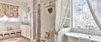
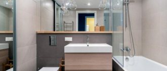
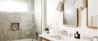
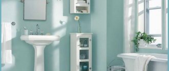
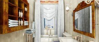
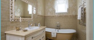
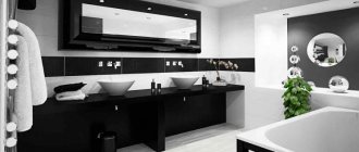
When we talk about an Italian-style interior, we imagine a chic room in the antique baroque style with many elaborate details and many mirrors. Indeed, until recently, Italian designers worked in the style of Venetian luxury, and this design has long been entrenched in many rich houses and has become a kind of sign of Italian quality. But over time, their approach to the design of houses, rooms and furniture also changed: there were much fewer details and decorations, the form became more strict, and the color from delicate pastel began to tend to more “serious” shades.
The Italian-style bathroom has undergone the same changes. Although this does not mean that Italians do not pay due attention to it. It’s just that over time, the bathroom has become more multifunctional, and the furniture, the decoration of its walls and floors, even the lighting have taken a slightly different direction. Therefore, if an Italian-style bathroom has become your goal in achieving the desired design, then you need to make sure that it is spacious, since it must accommodate the bath itself, a toilet, a bidet and, of course, a comfortable sink with spacious furniture for towels, personal hygiene products and cosmetics.
Style Basics
Italians manage to combine simplicity with sophistication. This trait was transferred to the style. It is only expressed in the use of soft and sunny shades.
It should be noted that this style originated in Ancient Rome. France had a strong influence on the formation of this design direction, which brought some sophistication and sophistication. Everything was harmoniously combined with the country style, which is not alien to the Italians. As a result, a bohemian but simple direction in the design of the room was born.
Here it is important to use natural materials, which are characterized by a certain carelessness, but are “compatible” with the surrounding world. As a result, a special complacent atmosphere is created.
Modern trends in interior design have not had a significant impact on the fundamental aspects of the Italian style, although they have provided new opportunities to improve its virtues.
What to do in the bathroom
The bathroom should be designed taking into account space saving. The large elements used should not clutter the room, so it is better to place them on the walls. A minimum of small parts can be used. In this case, the use of elements from living rooms is allowed. You can even use upholstered furniture if space allows, as well as the material from which this furniture is made. Do not forget that in the bathroom there is often a high level of humidity, which negatively affects the performance characteristics of many materials, especially natural ones.
You can hang a large mirror on the wall, or use a small chest of drawers on the floor. A circular curtain can be placed in the center of the room. Its color can be gray or white, less often – beige. The remaining elements should also be selected taking into account the special warm harmony that is created. That is, it is better to choose non-white plumbing fixtures, appliances, and ceramic tiles (if they are used in decoration).
Story
There are more than 20 factories in Italy, the main activity of which is the production of tiles.
The oldest factory was founded more than 150 years ago and still does an excellent job.
Many bathroom tile factories are truly family businesses, with old tile-making traditions being passed on from generation to generation.
Some modern enterprises produce exclusive models and collections that will not only diversify the interior, but also turn the bathroom into a real gallery.
Important! Manual labor is often used to create a tile pattern.
Many Italian factories continue to introduce innovative technologies that allow them to produce the highest quality products.
More recently, Italian craftsmen have introduced tiles to the wide market, which are called “glaze” for their unique coating.
Glaze applied to ordinary earthenware is also the know-how of Italian craftsmen.
Also in the production of tiles, different types of clay are used, but mainly white, which is mined in Italy.
All materials are of the highest quality, recognized throughout the world.
Colors
The colors in the bathroom should be light and cool tones. The classic solution is to use an ivory shade, largely due to the fact that it combines well with active color additives.
It is allowed to use olive or blue tones. In any case, it is important to focus on the fact that the background should be light, visually expand the space, and fill the room with air. Since the Italian style was influenced by the French spirit, the design is often complemented by textured elements of pink or, say, peach. For example, small patterns with smooth lines.
And here you need to achieve harmony in the combination of colors: the lighter and cooler the base, the warmer and darker the active colors should be. Soft color should be combined with texture. If the interior is based on warm shades, then it is worth diluting them with brighter colors. However, such elements must be used carefully and in doses to achieve true harmony.
Feeling of peace and cozy comfort
PreviousNext
The main thing…
Since the Mediterranean style implies simplicity, practicality (functionality) and comfort, these qualities will be the basis of the entire room, and this will affect everything. In terms of plumbing, this is expressed in bronze or iron faucets, durable and massive, but most importantly in hidden communications, that is, only the functional part remains visible, for example, the faucet spout, valves to turn the water on and off, and so on. And everything else is hidden behind the trim. This not only looks aesthetically pleasing, but also has a practical approach, because it is much easier to clean up. In addition, it visually enlarges the space and makes it more spacious, which corresponds to the Mediterranean style.
More about finishing
Walls
In this case, the use of Venetian plaster is considered an excellent approach. This material allows you to achieve a certain carelessness, as well as texture, which is characteristic of the antique direction.
Sometimes it is necessary to use ceramic tiles due to their characteristics. In this case, it is recommended to use large samples with a blurred pattern applied. You can use mosaics to highlight certain areas. At the same time, you need to remember about the color scheme so as not to go beyond the stylistic boundaries. Do not use square or large shapes. Therefore, the mosaic should be small.
If painting is used, then acrylic-based paints can be used.
You can also use stone and plaster elements in the interior. With their help you can emphasize the doorway.
Ceiling
Materials can be used in a wide variety of shapes - the restrictions are minimal. Tension or hanging solutions are suitable. They allow for proper lighting, which is important. The surface can be matte or glossy.
You can also simply paint the surface using several layers. “Liquid wallpaper” is also suitable.
The most affordable option is ceiling tiles. It hides coating imperfections well, can be painted on, and does not require special care. However, such tiles do not fit well with stucco.
You can also decorate the ceiling using wooden beams. The main thing is not to use plastic elements, typical solutions for office use.
Floor
The composition is completed by the floor covering. You can use tiles with a rough texture. In this case, it is advisable to take care of installing a heated floor. This will allow you to use the room more comfortably.
Other materials are either not suitable for use in the bathroom or do not fit with the stylistic solutions characteristic of the Italian style.
Furniture
And here the French had a certain influence. At one time, France and Italy developed at a similar pace in the art of carpentry. The French came up with the idea of introducing metal elements and forging, while the Italians paid more attention to textures and patterns. An excellent solution is dark woods, complemented by curls. A massive tabletop is used, which is complemented by thin legs.
When choosing furniture, it is important to combine shapes and colors to achieve overall harmony in the bathroom design.
Lighting
This aspect is not always given due attention when decorating interiors, but lighting in the Italian style plays an important role. In this case, it is worth using diffused soft light. For example, darkness may be created in the center of the room. Of course, in the mirror area it is worth using more concentrated lighting. Therefore, it is necessary to combine solutions to obtain the desired stylistic effect, but without compromising comfort.
You can use pendant lamps that will fit perfectly into the design. As additional lighting, it is permissible to use a light source in the form of a kerosene lamp or sconce.
Paola Navone – the soul of Italian design
May 23, 2020
Paola Navone is the prima and soul of Italian design. Practicality, charisma and eclectic chic are surprisingly intertwined in her projects. Navone's works are independent and complete, be it an object or an interior. At first glance they may seem minimalistic. But if you look closely, in each item you can notice many subtle details that carry individuality and a transparent flair of spontaneity.
In the 1980s, Paola Navone was part of the famous avant-garde design group Alchemy. Their projects were a symbiosis of popular culture and radical performance. With its eccentricity and ironic presentation, “Alchemy” was reminiscent of a teenager protesting against “adult” forms. But it is precisely this kind of protest that can develop into something more. As happened with Navone . Having separated from the group, she began to create something original, devoid of kitsch, but capable of charming and captivating.
Perhaps the main secret of the designer's undoubted success is that she does not try to express either herself or a certain concept in her projects.
“I am against it when a thing is developed and made as a museum exhibit. I resist no less when a designer tries to express himself in his piece, I believe that this is the complete opposite of the creative process,” says Navone .
The designer's interiors are eclectic. They can be bohemian, luxurious and minimalistic. But their originality does not interfere with comfort, on the contrary, it contributes to it. An example of this is McDonald's , designed by Navone . The uniqueness of the design brought a touch of home comfort to everyday life. The calm color of the walls is combined with stylishly “shabby” parquet. Lamps suspended in “creative chaos” create an immediate atmosphere. Furniture pieces of varying shapes and styles evoke the feeling of a family breakfast, as if each family member has brought their own favorite chair to the table. The composition is completed with bright accents in the form of frames, decor and small ottomans.
McDonald's
In the 1980s, Paola Navone worked in Southeast Asia, where she began a long love affair with ethnic themes. They are present in her collections in the form of unusual patterns and decorative elements, as well as in shapes and materials.
Joyce store in Hong Kong
When choosing materials, Navone does not adhere to anything specific. She is able to weave exotic textiles from India and Morocco and wood from Africa into her work, using them together with metal and plastic. Eclecticism in this case is not a goal, but a means. This combination gives rise to independence of both the interior and the object, while at the same time showing a complete picture of their expression.
“Very often, when I visit my clients' factories, they tell me that I am a big specialist in waste bins. I'm always rummaging through what they throw away. Because very often a professional in one field or another is not able to appreciate some extraordinary little things, take a fresh look at them, the view is “blurred,” as they say. And I can...”
Despite the individual approach, Paola Navone values tradition. Gervasoni 's chief designer , Navone maintained their approach: natural materials and wickerwork. But traditions can be changed to suit yourself. Therefore, she expanded the range of materials, introducing woven leather in combination with aluminum. She also diversified the brand’s palette by including bright shades. In addition, the designer transformed the type of weaving itself, proposing the use of large knitting, which instantly gained popularity.
In 2020, Navone presented a furniture collection for Gervasoni , successfully combining the designer’s new ideas and the traditions of a brand that is more than 100 years old. Without a shadow of a doubt, this collection can be called magical, as it embodies style, craftsmanship and magical charm. When creating it, Navone used an unusual combination of materials: wood, ceramics, marble, aluminum. The textile palette is expressive and restrained. It’s as if the color is about to burst out of the proposed frames.
The highlight of the collection is the Moon . Its base, made of ceramic, resembles the surface of the moon. This effect was achieved thanks to the heterogeneous rough texture created by hand. Smooth curves reminiscent of a classic vase support the slim cast aluminum top. The general trend of the collection speaks more about classic forms. But even they, under the leadership of Navone , acquire a new charming appearance.
“Designers are happy people. We create our objects not for the sake of fame, but because we approach life with great curiosity,” says Paola Navone .
Currently, Paola Navone is the chief designer of the Gervasoni . But she also collaborates with many popular brands, such as: Antonangeli Pitti Immagine Casa , Arcade , Art trading Contract , Mondo , Bisazza , Natuzzi , Swarovski , Letti&Co . In 1984, the designer was awarded the Award , in 1999, the Prix d'Excellence from Marie Clair e magazine, and in 2000, Architectur & Wohnen chose her as designer of the year. Navone also published the book “ Tham ma da – The Adventurous Interiors of Paola Navone ” which is rightfully considered one of the best books about design.
You can read :
Philippe Starck. From technology to love
Patricia Urquiola. Sensual furniture
Gaetano Pesce: pioneer of “emotional design”
Text: Kulikova Diana
